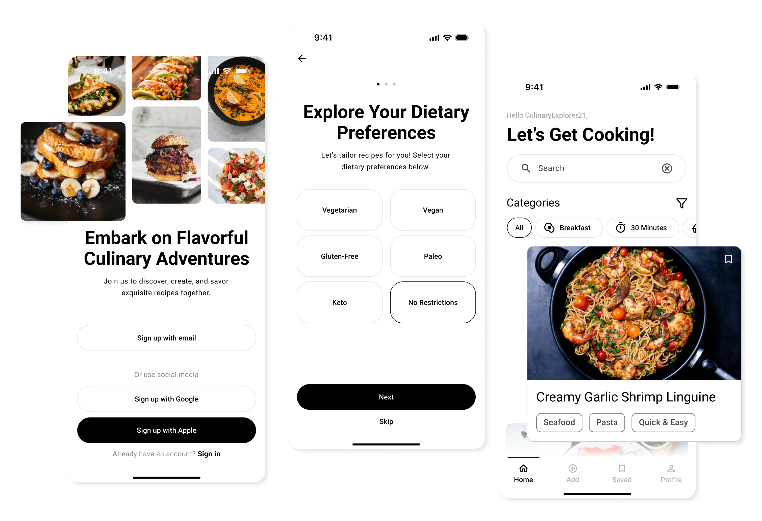
Designing a More Delicious Experience
A meal-planning app should feel effortless... yet users struggled with clunky navigation and uninspiring layouts. I reimagined the experience, crafting an intuitive interface with clear hierarchy, engaging visuals, and seamless grocery list management. The result? A 30% reduction in task time and a more delightful way to plan meals.
My role
Visual Design, Research
Problem Statement
FlavorBloom, a meal-planning app, was facing user frustration due to complex navigation, irrelevant recipe suggestions, and a lack of intuitive tools for grocery list management. This resulted in high user abandonment rates. My challenge was to reduce friction and create a more personalized experience that catered to dietary preferences, simplifying the planning process.
Research
I led both quantitative and qualitative research to understand user pain points. Performed a heuristic analysis of the FlavorBloom Recipe App, mapping out the entire user journey. This allowed me to identify usability issues and calculate the number of clicks needed to complete key tasks. From there, I conducted a competitive analysis to understand trends in recipe apps and highlight areas where our app fell short in delivering a seamless experience.
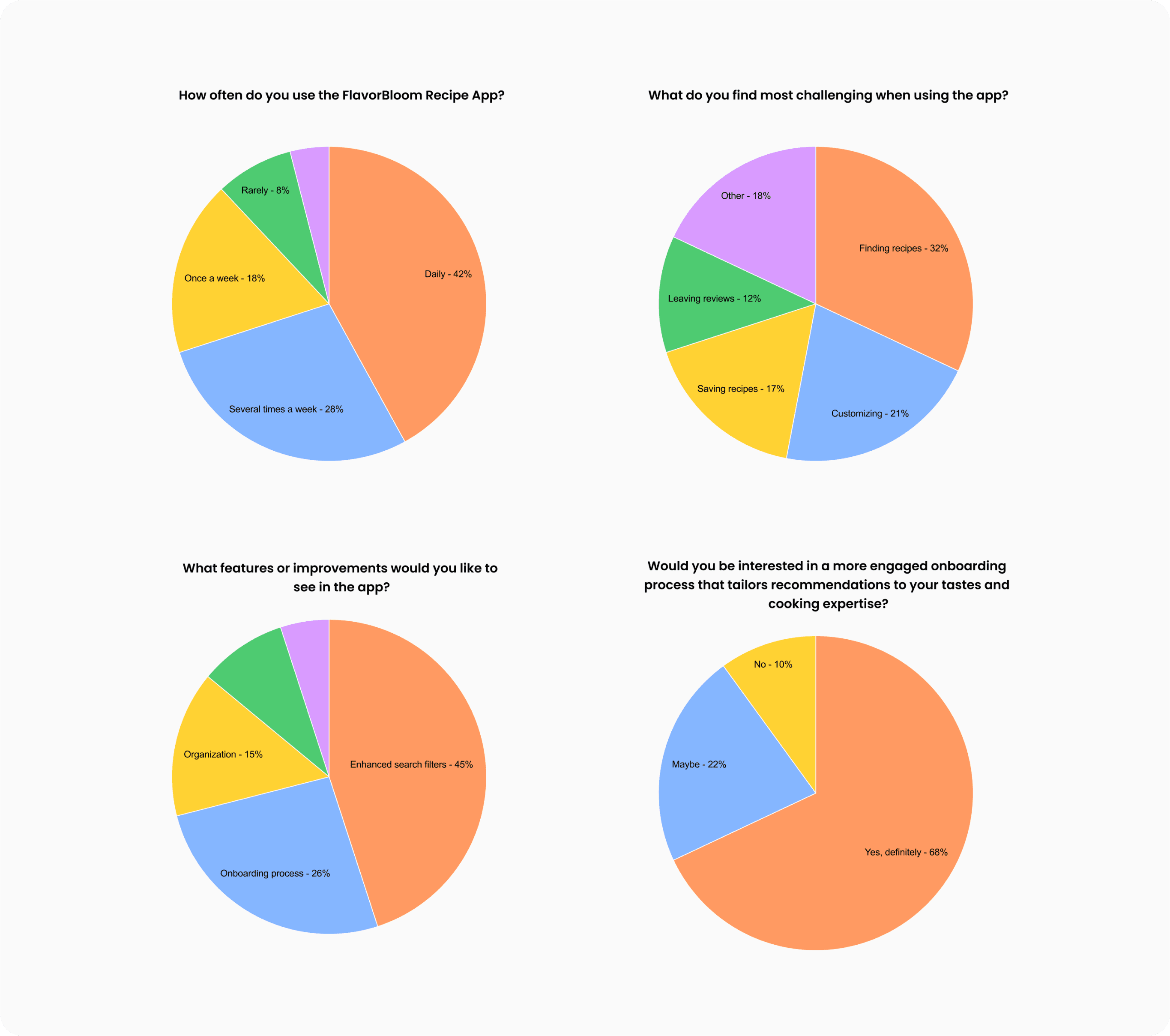
User Testing
To further understand the app’s pain points, we conducted usability testing with a diverse group of participants. Here’s what we learned:
Task: Add a New Recipe
Results: Users found it difficult to locate the "Add Recipe" feature due to convoluted navigation. This highlighted the need for a more intuitive placement of essential features.Task: Search for a Gluten-Free Dessert Recipe
Results: Participants had trouble refining search results, emphasizing the necessity for a user-friendly search bar with real-time suggestions and improved filtering options.Task: Save a Recipe to Your Favorites
Results: The "Save" button was hard to find. Users expressed a need for a more prominent way to save recipes for later reference.
These insights, combined with feedback from competitive analysis, guided our decision to focus on enhancing the app’s usability, ensuring a smoother and more intuitive experience for users.
Collaboration with Engineers
Throughout the process, I worked hand-in-hand with engineers to address technical challenges. Together, we created solutions to enable real-time personalization and reduce friction in the grocery list management system. Our iterative process allowed us to quickly resolve any bottlenecks and deliver a seamless user experience.
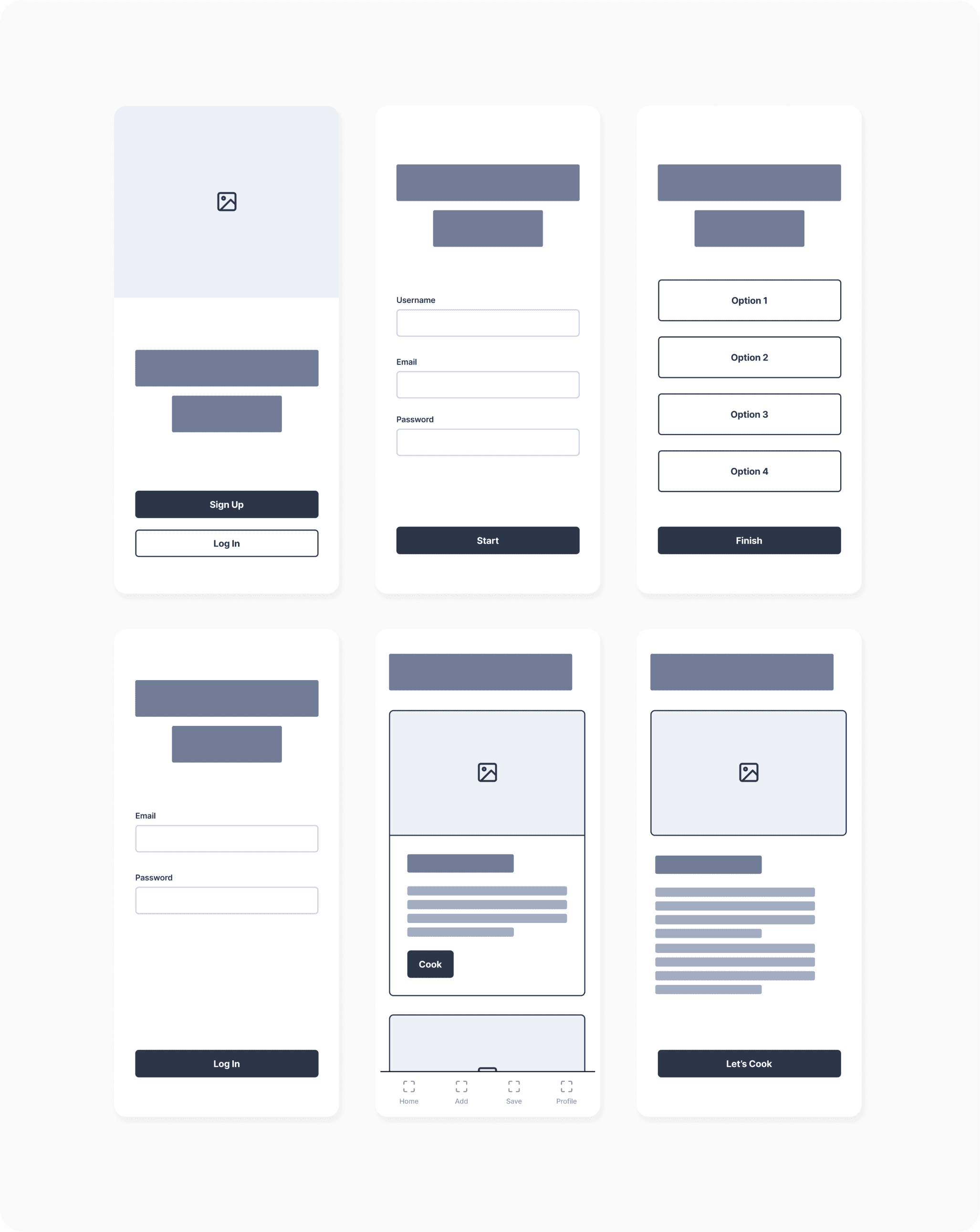
Solution & Design Process
To enhance user engagement, I took ownership of redesigning the app’s core features. A key focus was on personalizing the onboarding process to align with users' dietary preferences, skill levels, and flavor profiles. This transformed the onboarding journey into a more tailored experience, empowering users to receive recipe recommendations that suited their individual cooking styles.
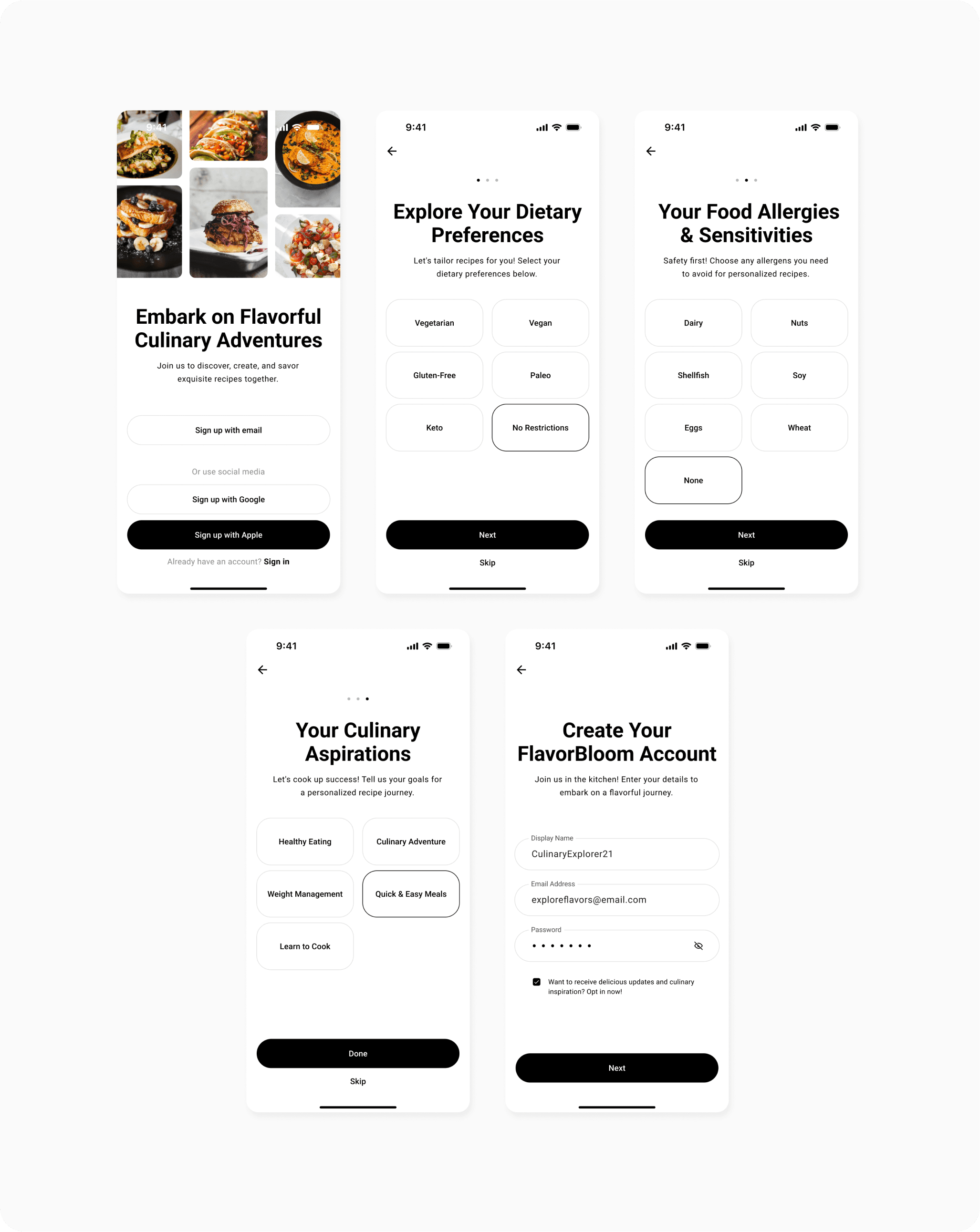
In response to user feedback about the app’s visual clutter, I streamlined the design by simplifying interfaces and decluttering the layout. This improved usability while creating a more aesthetically pleasing experience. Ample white space and clean visuals allowed users to navigate the app with ease and focus on their cooking.
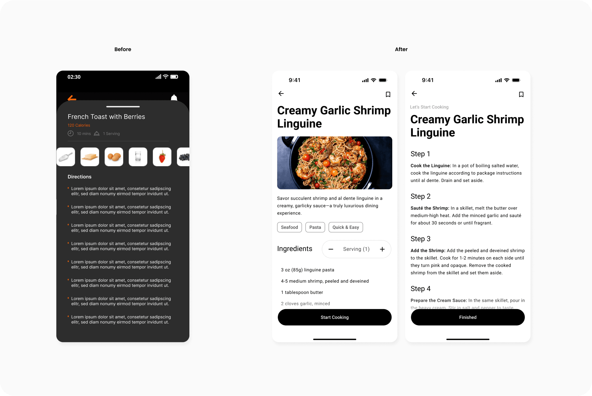
Additionally, I introduced a direction isolation feature. By dedicating a space for viewing step-by-step cooking instructions, users could concentrate on one task at a time, leading to a smoother, more focused cooking experience. This minimized errors and distractions, making the process more enjoyable.
Throughout the redesign, I collaborated closely with engineers to create functional prototypes that seamlessly integrated these improvements while ensuring the app could be scaled for future enhancements.
Business Impact
Early testing revealed a projected 30% decrease in task completion time, significantly improving the speed at which users could plan their meals and manage their lists. These optimizations were expected to boost long-term engagement and increase user retention by delivering a more personalized, efficient experience.
