Rethinking Checkout: From Friction to Flow
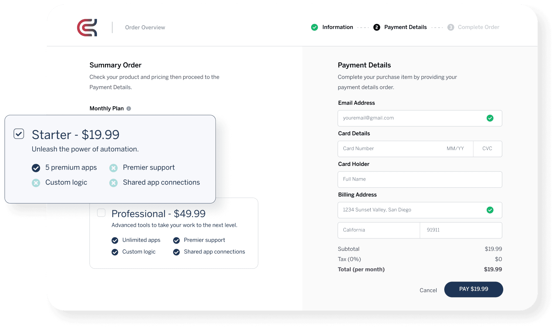
A confusing checkout can mean the difference between a sale and an abandoned cart. By diving deep into user behavior, I identified key friction points, streamlined the flow, and introduced early email capture. The outcome? A 20% drop in cart abandonment and a smoother path to purchase.
My role
Visual Design, Research
Problem Statement
E-commerce businesses often lose potential revenue due to abandoned carts caused by overly complex payment processes. My challenge was to simplify the checkout experience and reduce friction to increase conversion rates.
Research
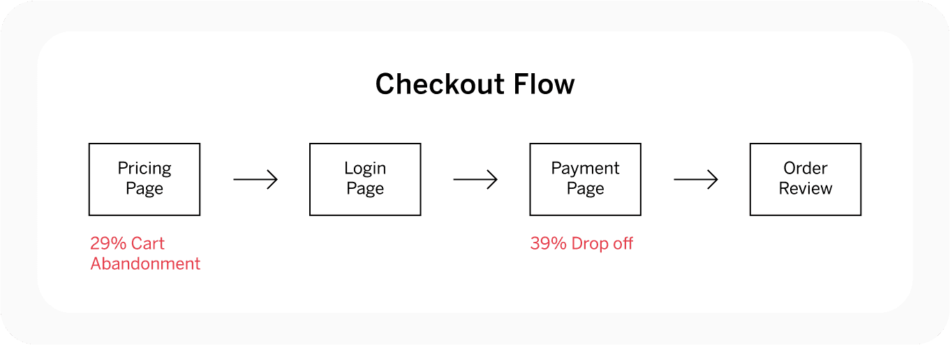
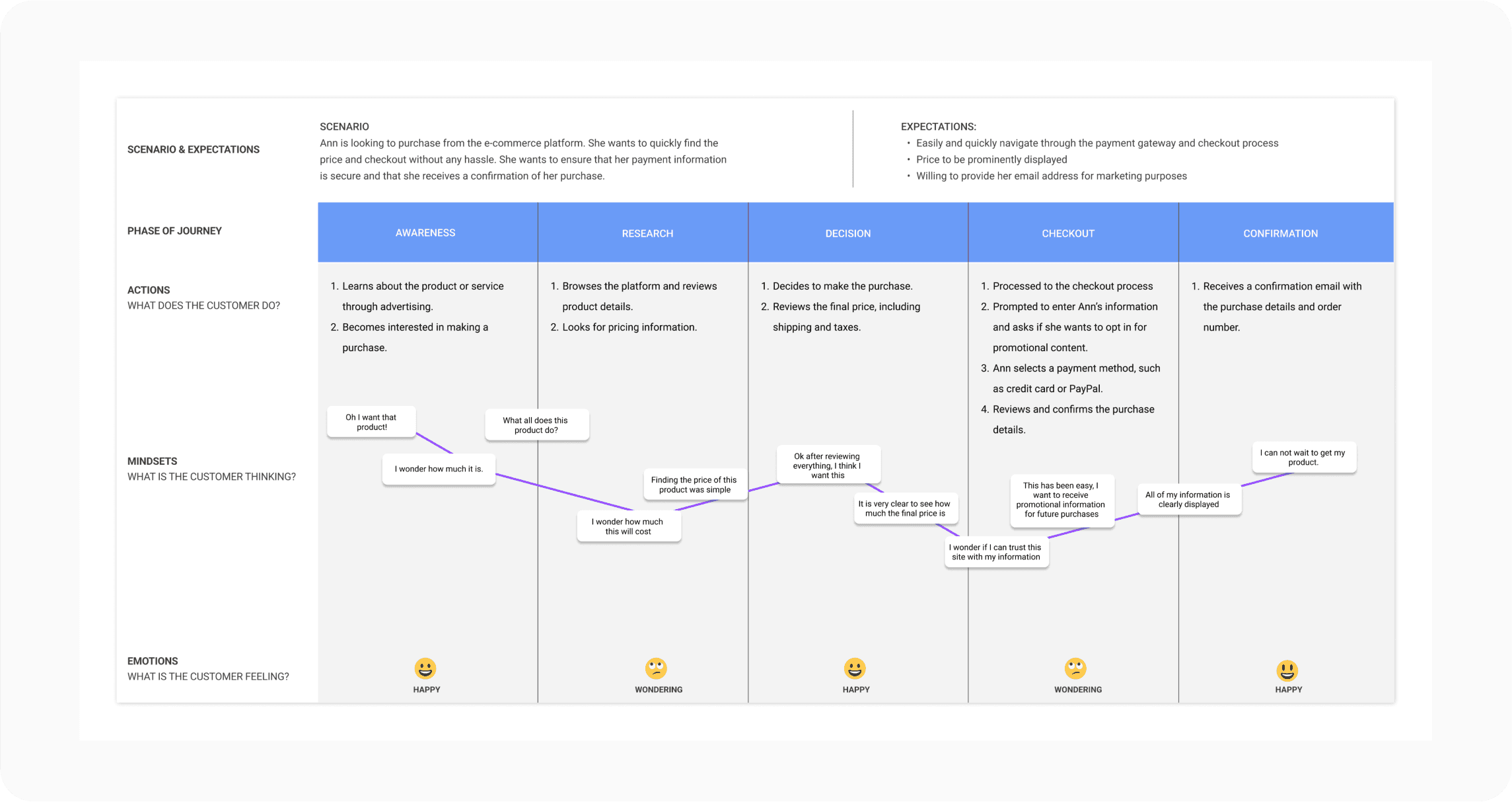
I began with a heuristic analysis of the entire checkout process, mapping the user journey to identify usability issues and count the number of clicks required to place an order. This helped uncover inefficiencies and potential pain points.
I followed this with competitive analysis, exploring common trends and best practices in fast and seamless checkout experiences across the e-commerce industry.
Finally, I conducted multiple interview sessions with stakeholders who regularly interacted with customers. Their insights highlighted recurring frustrations with the current checkout process, further validating the issues I identified.
Collaboration with Project Manager and Stakeholders
Throughout the process, I collaborated closely with the project manager and key stakeholders. Together, we prioritized key improvements and ensured the design aligned with both user needs and business objectives. Their feedback helped guide the iterations, ensuring that each step of the redesign solved critical issues without introducing new challenges.
Solution & Design Process
To address the issues discovered in the research phase, I focused on three key improvements:
Reorganizing the Order Summary
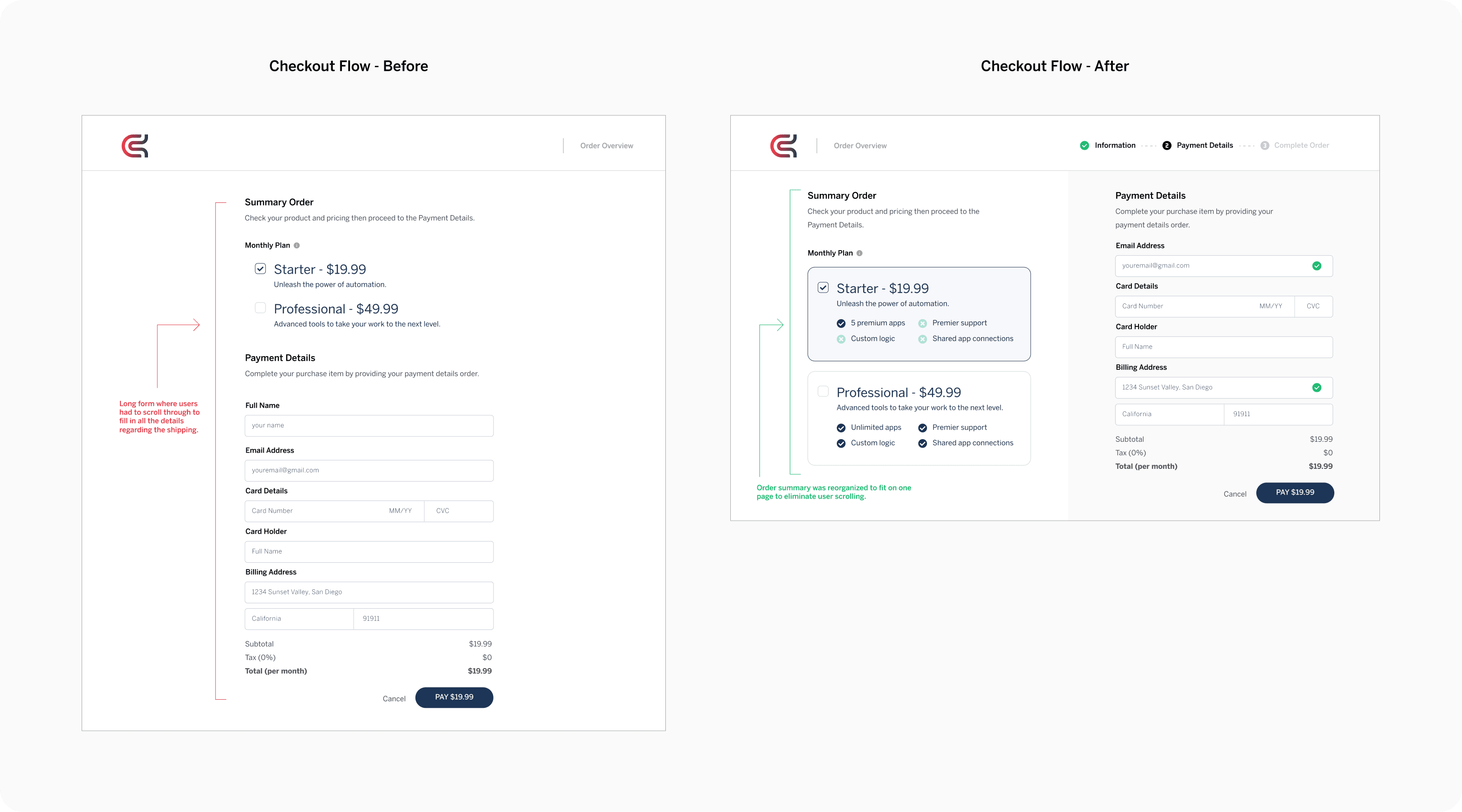
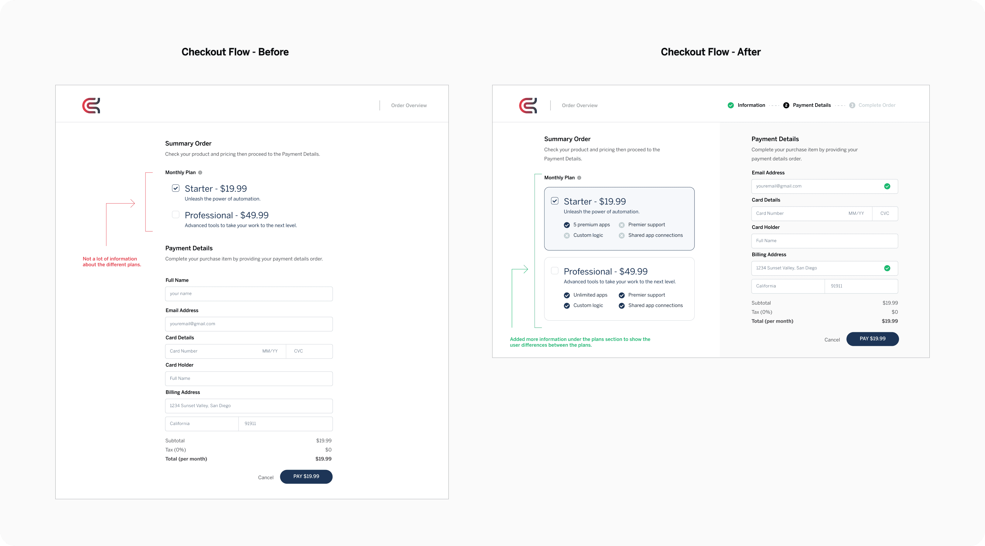
I redesigned the order summary to fit on one page, eliminating the need for users to scroll. This reduced friction and improved task completion rates.
Enhancing Plan Comparison
I added more detailed information under the plans section, making it easier for users to distinguish between various options. This improved clarity and empowered users to make faster decisions.
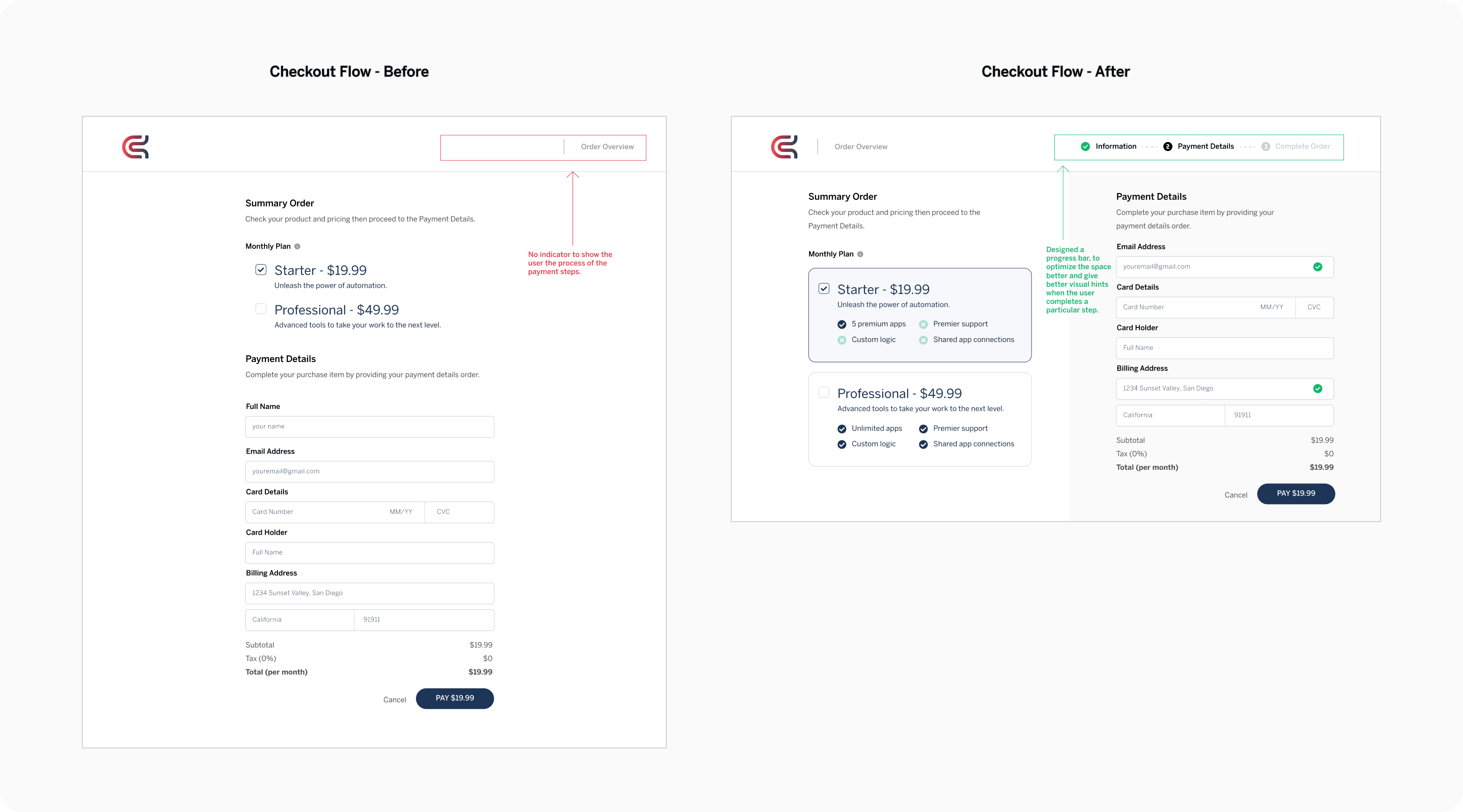
Introducing a Progress Bar
To optimize the space and improve visual feedback, I designed a progress bar that indicated which steps had been completed and what remained, offering users a clearer sense of control and progress.
Business Impact
Testing projected a 20% reduction in cart abandonment rates. These improvements are expected to drive conversions and boost overall revenue.
